Shaping the future - Re-Design as a sign of constructive change
The management team of B&V Architekten wanted to revise the logo of the architecture firm. The reason for this is a generational change in the management team and the demand to transform the identity that has grown over the years into the future.
The current logo is made up of four triangles. It originally consisted of two black squares and was supplemented by two elements to visualize the union of the four partners. Since this history is no longer relevant today, the logo is to be rethought.
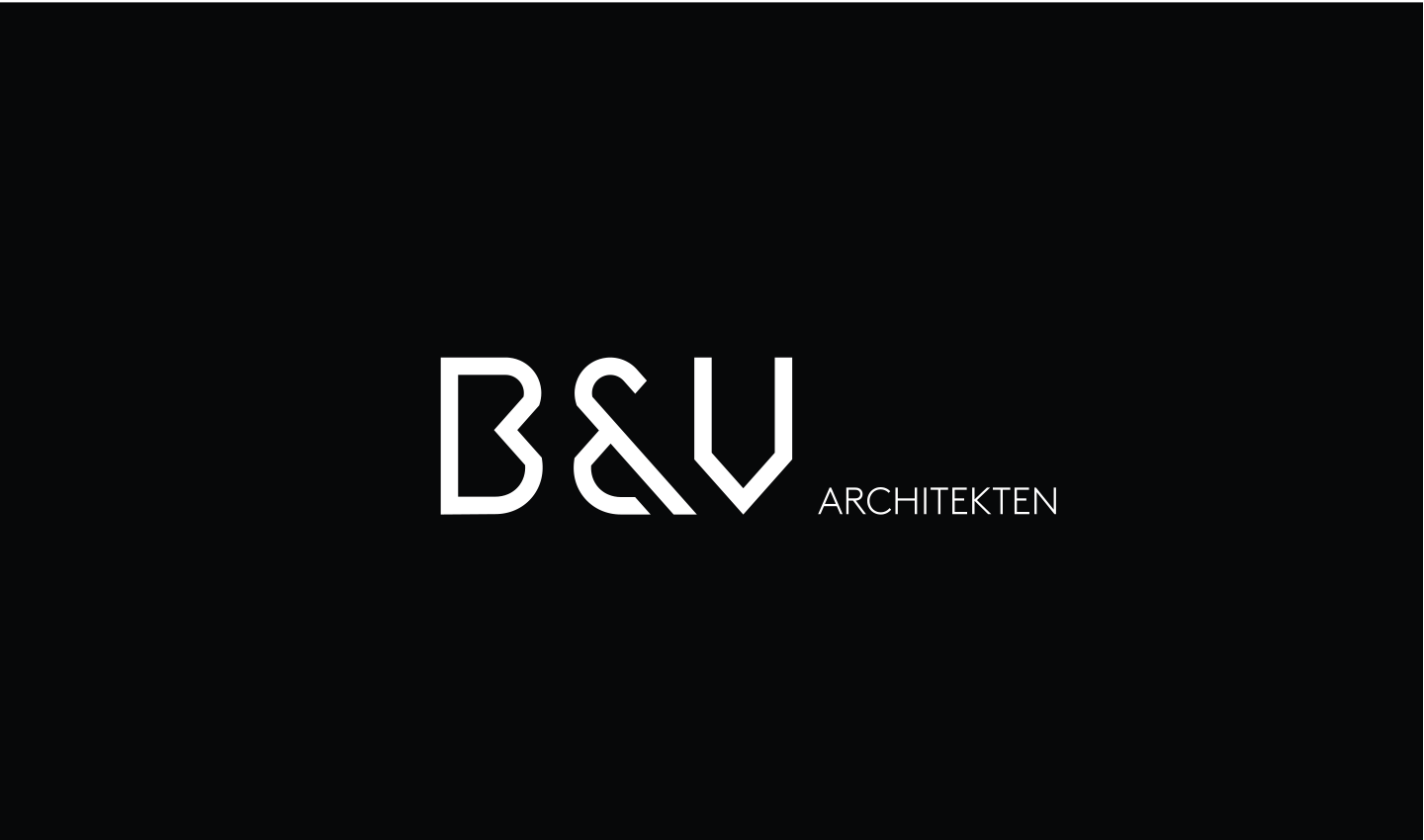
The focus of the new word-picture mark should be on the abbreviation "B&V". It stands for the roots and for the close and respectful relationship to the past. The "&", whether represented commercially or mathematically, symbolizes the connection between people, colleagues, partners and customers.
- Customer
- B&V Architects
- Deliverables
-
Corporate Design
Design
Creative Concept
Production - Year
- 2021
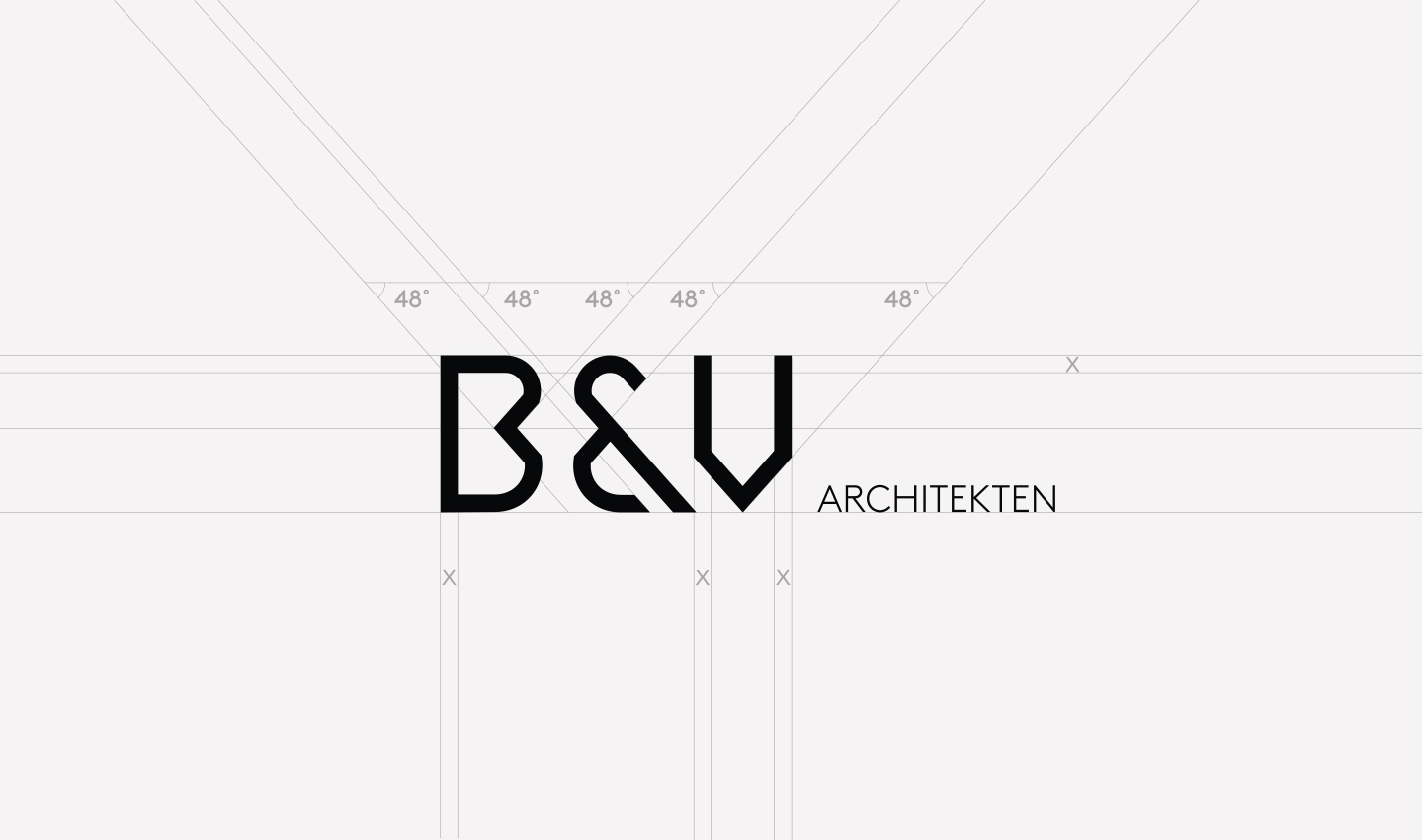
Combining minimalism with the soul and philosophy of the company was an exciting challenge. We opted for an iconic, very personal typography, presented in clear colours.
Eustachio Palumbo, Art Director at Orange Hive
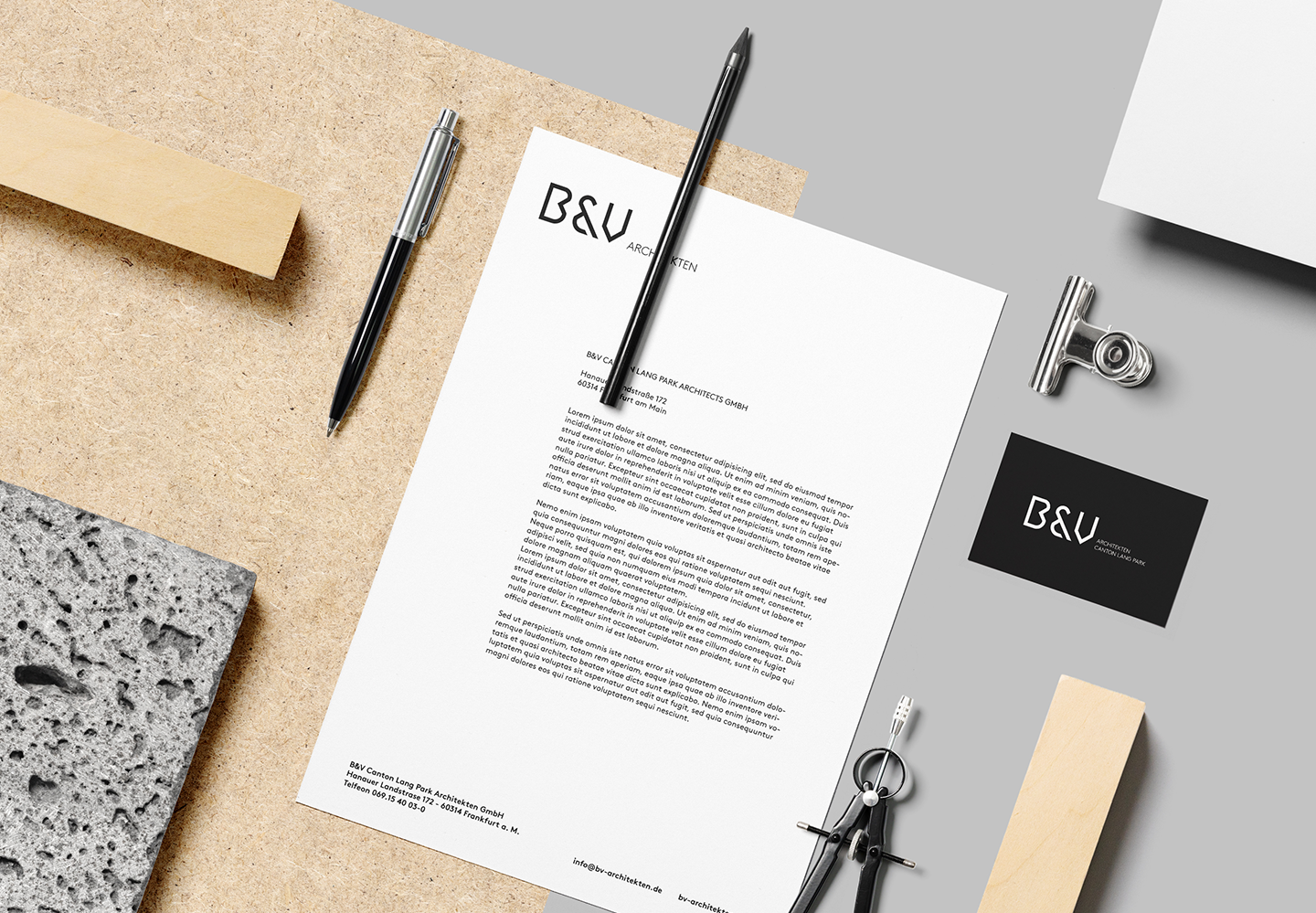
Contemporary and distinctive
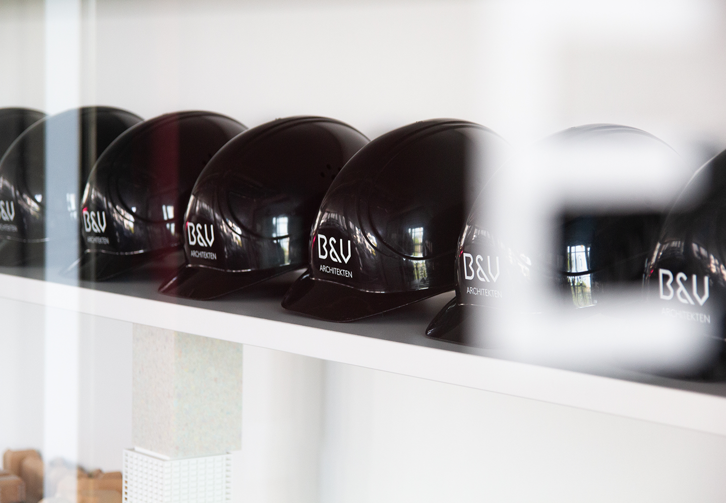
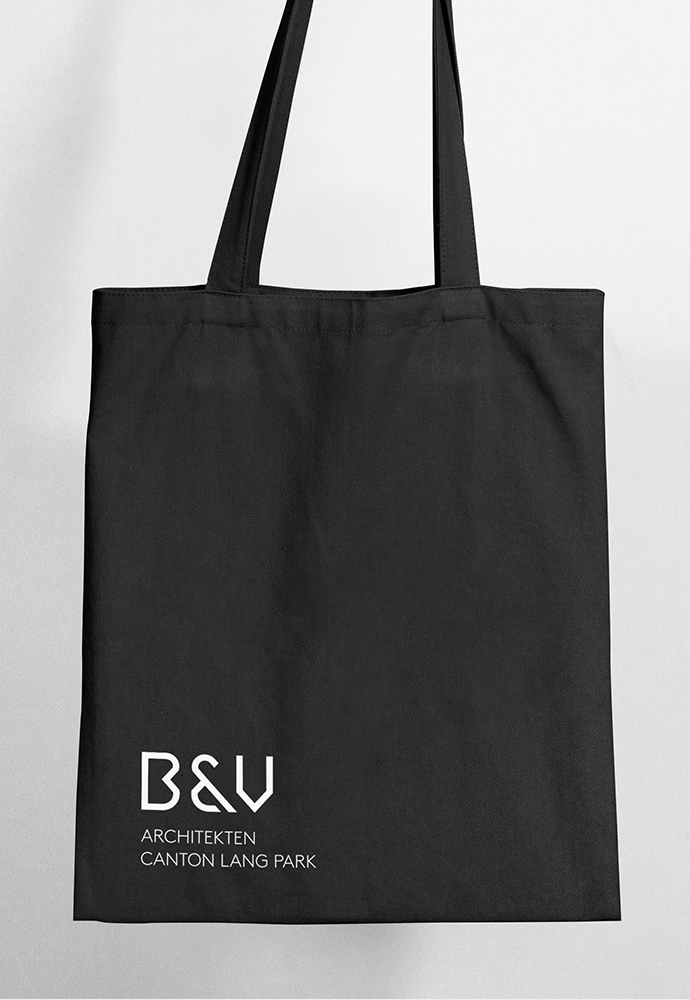
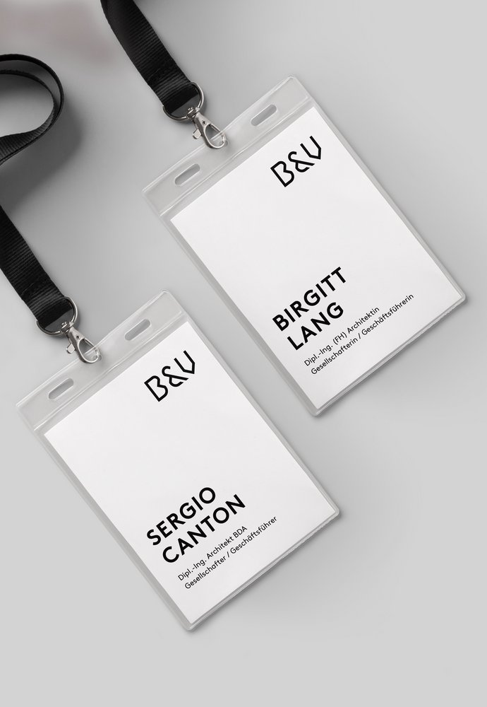
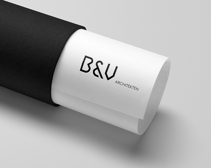
Orange Hive developed custom, bold typography and a clean design with smart, minimal elements. The logo gives itself modern & flexible, the diagonals follow a precise arrangement. The implementation lives up to the claim of reflecting architectural language and zeitgeist as well as combining recognizability with minimalism.
The logo - in strong black & white - stands here as a statement for timelessness, unexcitedness and expresses continuity.
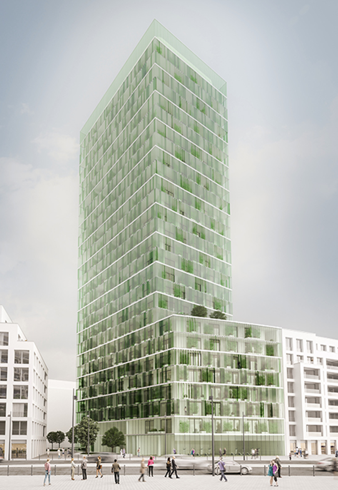
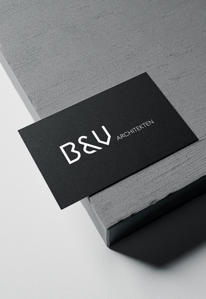
The new branding ushers in 2022, the new partnership between Birgitt Lang, Suk-Won Park and Sergio Canton. OH has designed a logo that could abstractly be a floor plan or a view of an architectural drawing. It seeks symbolic echoes in the office's history and finds the new clarity of the present.
Sergio Canton, Partner/Managing director of B&V Architekten GmbH
