A space for art
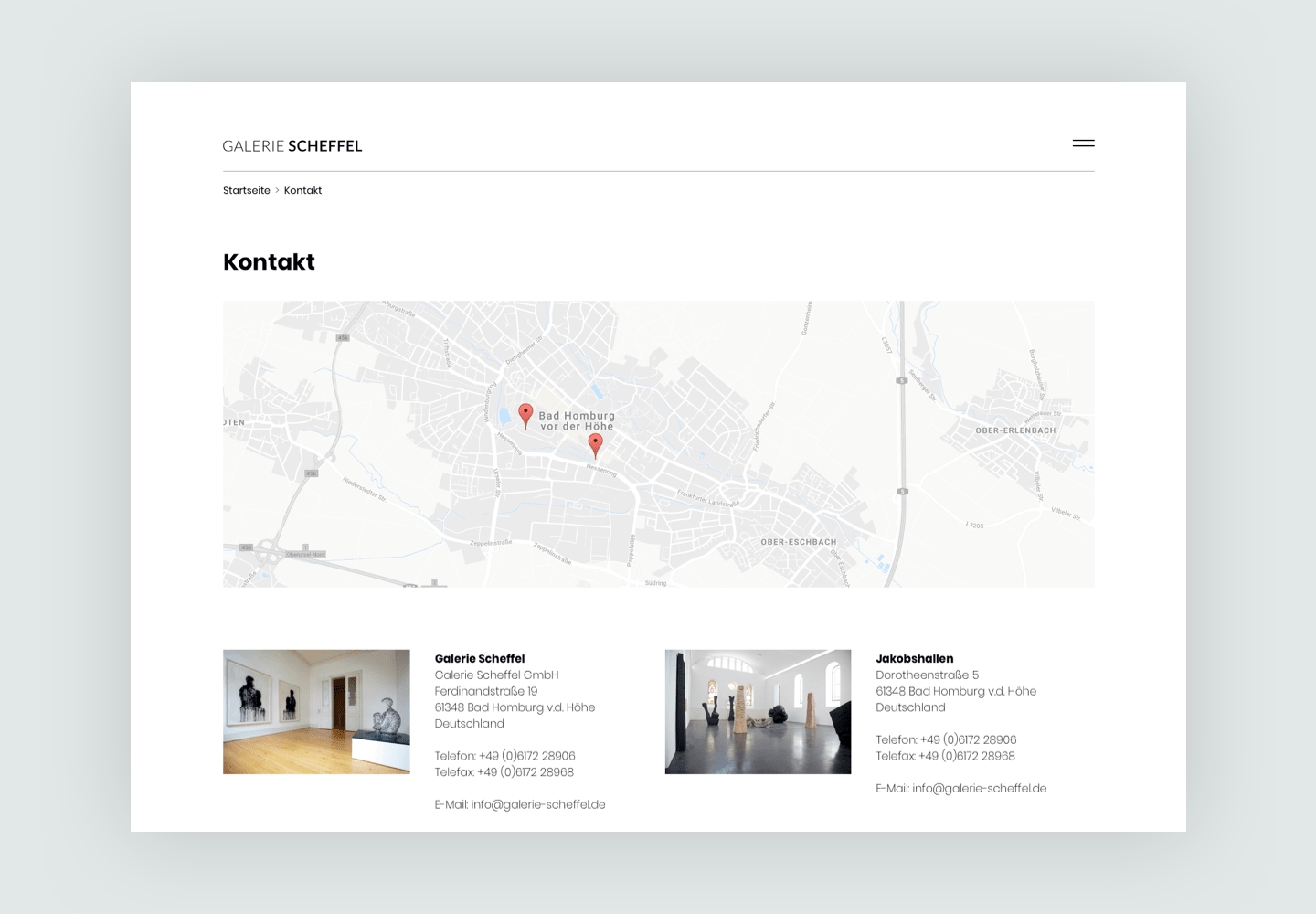
For more than 30 years, Galerie Scheffel has established itself as an internationally renowned representative of contemporary artists and a highly acclaimed organizer of public exhibitions of modern art. After Christian K. Scheffel had converted a former church building into an exhibiton space for his gallery, he commissioned us to design and realize a new website in 2019.
Our concept should correspond to his wish to present works of international artists, the gallery's exhibition locations, and the numerous book publications of Galerie Scheffel in a focused manner and without distracting attachments. Comprehensive informative, but not overloaded. Aesthetically minimalist, but not without an emotional perspective.
- Customer
- Galerie Scheffel GmbH
- Deliverables
-
Creative Concept
Web design
User Interface Design (UI)
User Experience Design (UX) - Year
- 2019
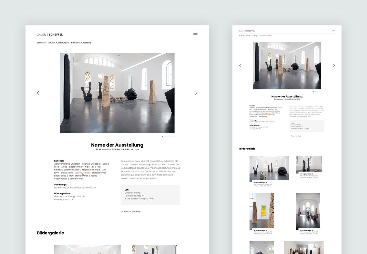
We created an online space where the artworks themselves can start a dialogue with us.
Wolfgang, Senior Creative Consultant at Orange Hive
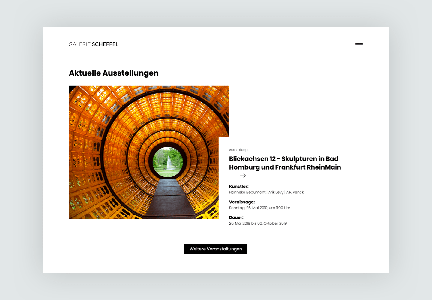
Art only
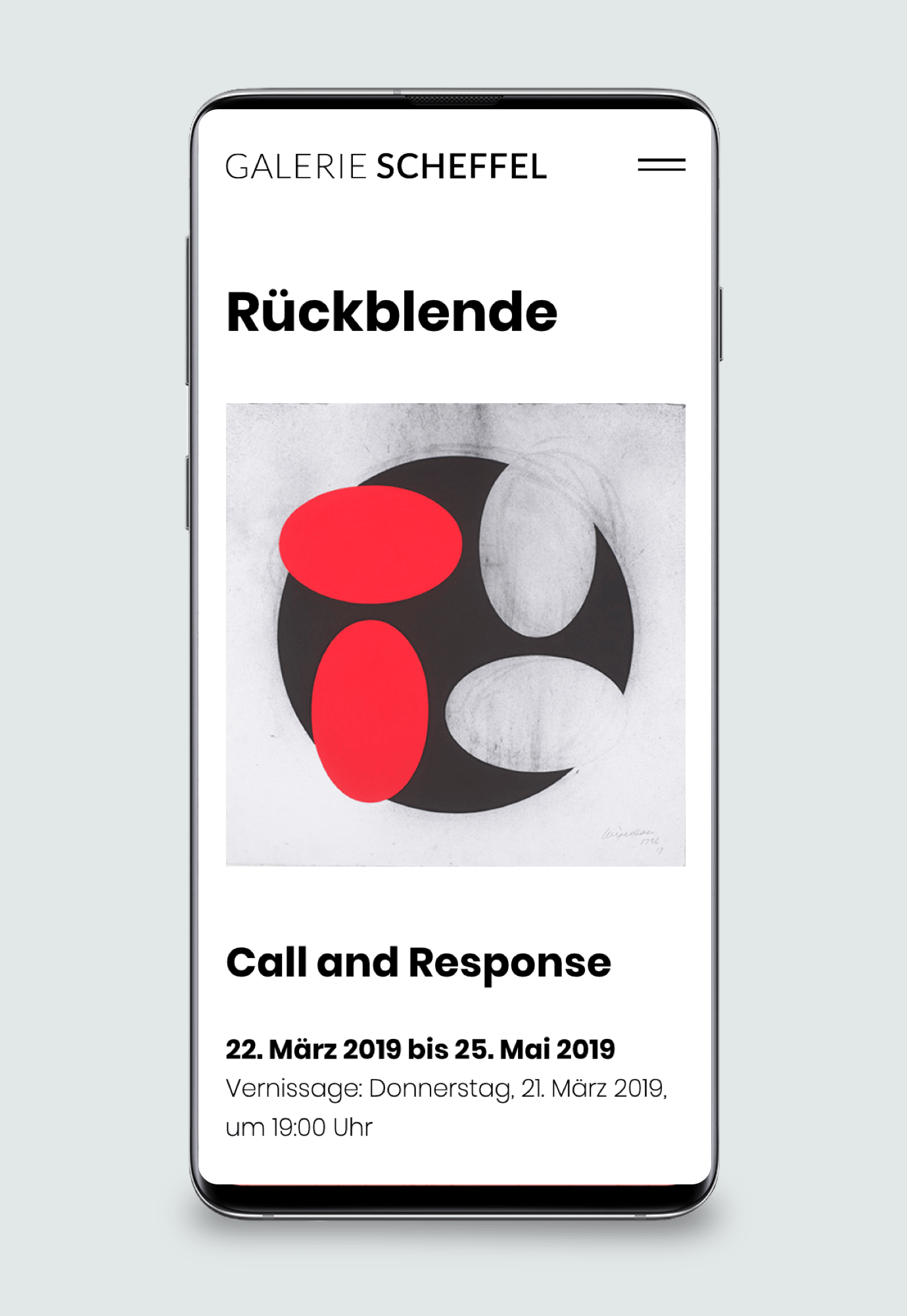
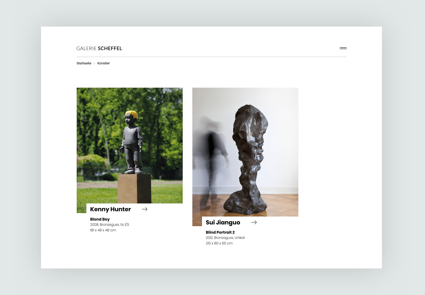
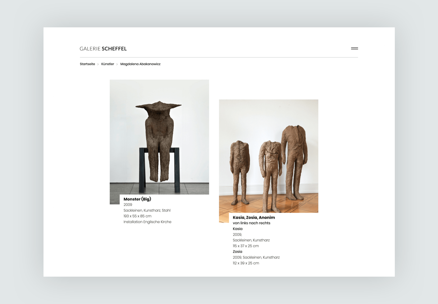
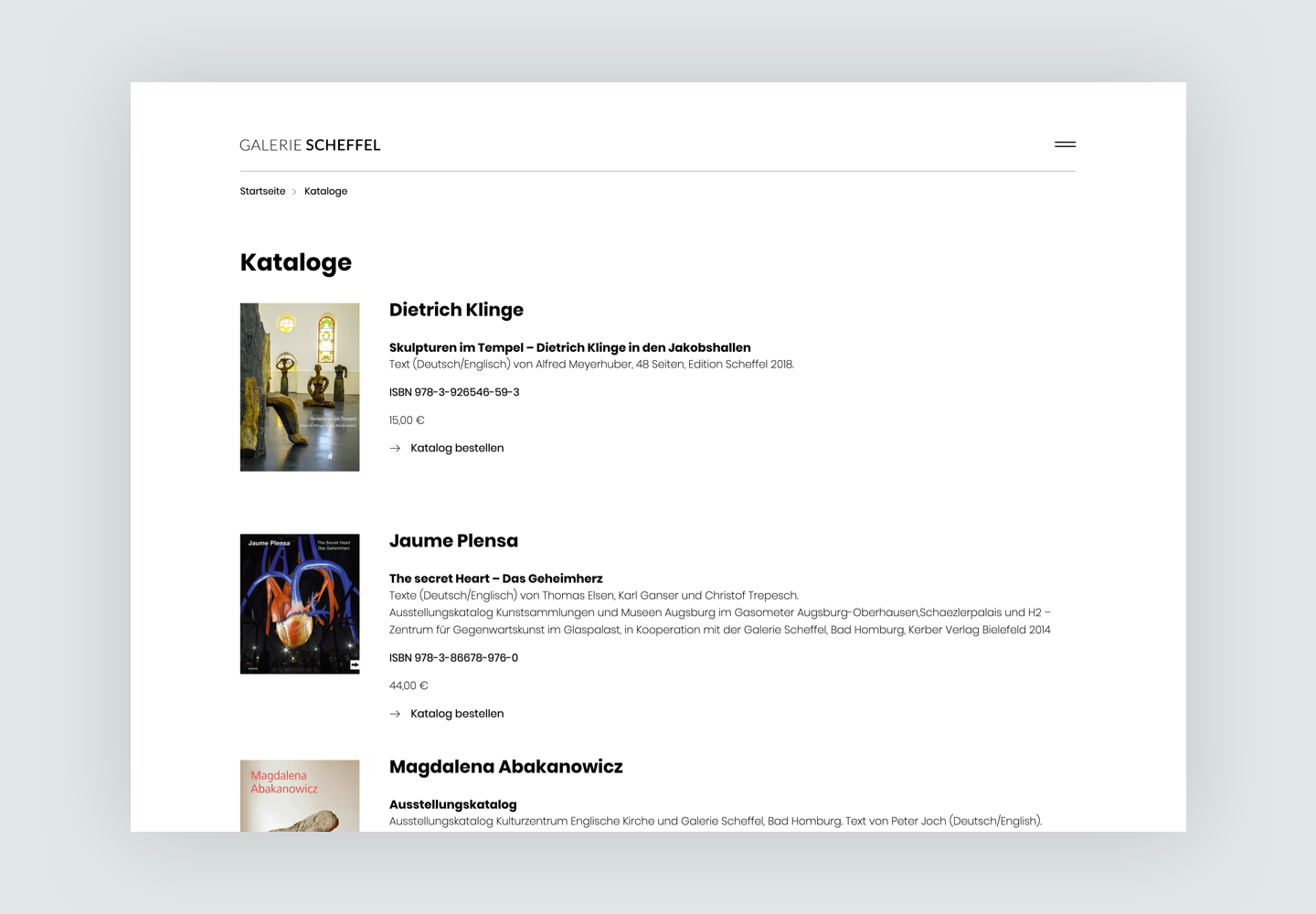
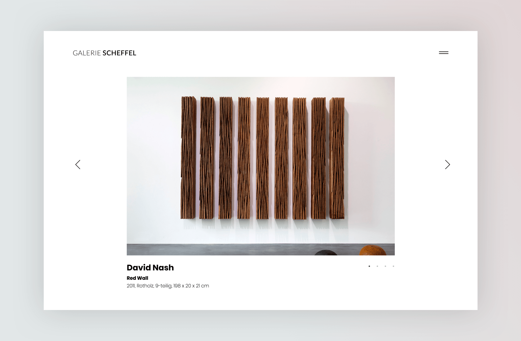
In its rooms, Galerie Scheffel offers optimal conditions for approaching art either with critical distance or enthusiastic curiosity, in each case individually. Visitors of the website first see a slider with photos of the current exhibition. The navigation provides differentiated access to represented artists, exhibitions and catalog publications.
Throughout the site, large format photographs of exhibited art work appeal to us. They are discreetly accompanied by comprehensive information on the works. Interpretation or technical-visual gimmicks are deliberately avoided. These are qualities that the art-interested public appreciates not only on desktop and mbile website but also when visiting Galerie Scheffel’s analog exhibition rooms.

