Self-confidence and restraint
Designing and developing a new website for Jo. Franzke Architekten has been a very exciting task for us. The architecture of the internationally renowned planning office impresses with meticulous planning, high-quality materials and careful execution.
The online presence should reflect this characteristic signature of Jo. Franzke’s team, while radiating restraint and self-confidence. We liked the task not least because of the good and close cooperation with our customer, being a globally active planning office having its headquarters not far from us in Frankfurt am Main.
- Customer
- Jo. Franzke Architekten
- Deliverables
-
Idea & Concept
Web Design
Web Development - Year
- 2013
High functionality and a design that has been thought through down to the finest details – the site should not only be enjoyable to look at, but also intuitive to use.
Oli, Head of Technology & Innovation bei Orange Hive

Architecture above all
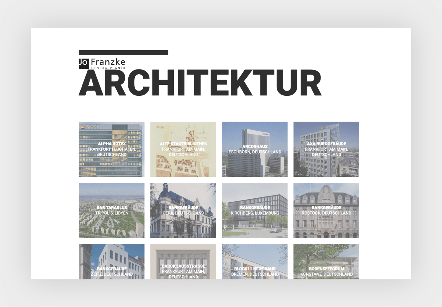
The site welcomes its visitors with full-size slider images of award-winning architecture projects. If you like, click directly into the project description. In the bottom bar, the navigation drawer and a sharing icon make further content, social media profiles and contact information intuitively accessible.


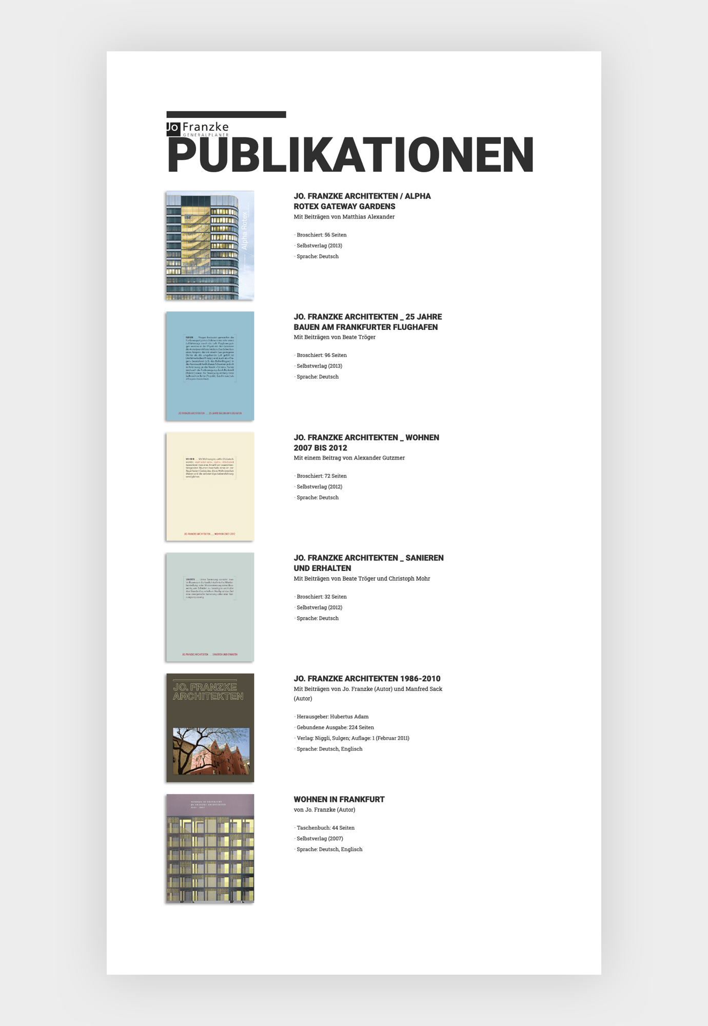
In addition to the dominant presentation of the project information, particularly the architectural photography, we attached importance to a differentiated filter function, which was also important to the customer. It facilitates the fast, expedient use of the website. With TYPO3, we have given the site an individual, yet easy-to-maintain, flexibly extendable and thus sustainable CMS as its foundation.

